Lesson: Data Interpretation - 02
Correlation and Scatter plots
If two variables have a relationship such that when one variable changes, the other
changes in a predictable way, the two variables are correlated. For example, there is a
correlation between the number of hours an employee works each week and the amount
of money the employee earns—the more hours the employee works, the more money the
employee earns. Note that in this case, as the first variable increases, the second
variable increases as well. These two variables are positively correlated.
Sometimes, when one variable increases, a second variable decreases. For example, the
more that a store charges for a particular item, the fewer of that item will be sold. In this
case, these two variables are negatively correlated.
Video Correlation and Scatter-plots
Sometimes two variables are not correlated, that is, a change in one variable does not
affect the other variable in any way. For example, the number of cans of soda that a
person drinks each day is not correlated with the amount of money the person earns.
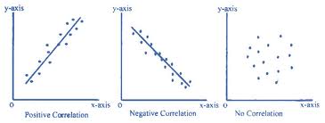
One way to determine whether two variables are correlated or not is to sketch a
scatter plot. A scatter plot is a graph on which the x–axis represents the value of one
variable and the y–axis represents the value of the other variable. Several values of one
variable and the corresponding values of the other variable are measured and plotted
on the graph:
- If the points appear to form a straight line, or are close to forming a straight line,
then it is likely that the variables are correlated.
- If the line has a positive slope (right to left), the variables are positively correlated.
- If the line has a negative slope (left to right), the variables are negatively correlated.
- If the points on the scatter plot seem to be located more or less at random, then it
is likely that the variables are not correlated.
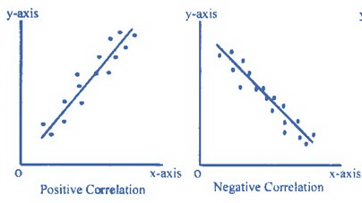
It is rare that the points on a scatter plot will all lie exactly on the same line. However,
if there is a strong correlation, it is likely that there will be a line that could be drawn
on the scatter plot that comes close to all of the points. Statisticians call the line that
comes the closest to all of the points on a scatter plot the “line of best fit.” Without
performing any computations, it is possible to visualize the location of the line of best
fit, as the diagrams below show:
Next to display next topic in the chapter.
Test Prep Lessons With Video Lessons and Explained MCQ
Large number of solved practice MCQ with explanations. Video Lessons and 10 Fully explained Grand/Full Tests.